Designing an Online Marketplace

Product Designer | UI/UX Design, Web Design | 2021
As a Freelance Product Designer for Gesture Shop, I re-designed their online marketplace from start to finish with a focus on improving overall usability. In addition, I did a complete company rebrand including logo design and copywriting.

timeline

5 weeks

tools

Figma

skills

UI/UX Design, usability testing, branding, visual design, copywriting

role

Freelance Product Designer

team

Rotimi Fadiya (client from Gesture Shop) and myself

Background

Gesture Shop is an online marketplace for personalized digital gifts. On the website, users can find artists such as songwriters, visual artists, and videographers to create customized gifts. The uniqueness of these gifts is what makes them special, hence why they are called Gestures.

Problem

The first iteration of the Gesture Shop was focused on getting the core functionality down. What it lacked overall, however, was:

  • Clear calls to action
  • A compelling narrative that explained the marketplace's purpose

This is what the website looked like before my re-design:

Empathize

Personas

I started building empathy with the users of Gesture Shop by reviewing user feedback for the two primary user groups: the customers and the artists. I created two personas to breakdown their attributes, pain points, goals and responsibilities, and motivations.

User Journey Map

I created a user journey map to communicate my understanding of the users and project scope to the client. The user journey map and design opportunities were informed by user feedback, personas, site mapping, heuristic analysis, and client input.

I prioritized opportunities for improvement based on client input and technical feasibility. The client expressed a strong desire to showcase artists' credibility to build trust with users thereby boosting sales. They suggested achieving this by creating a new page that would feature artists and their work. As such, I prioritized making the Home page more compelling, and creating a Meet the Artists page.

Other opportunities were not prioritized list due to technical limitations. For example, due to the platform's backend setup, design changes on the purchase workflow could not be implemented immediately.

Solution Exploration

I began sketching potential solutions for my re-design. While doing this, I focused on improving the call to actions and creating a more compelling narrative.

Improve calls to action

To improve the calls to action, I focused on three main areas:

  • Eliminating inefficiencies. Based on the user journey map, I designed a future user flow to identify which inefficiencies could be eliminated from the workflow. Mainly, embedding Gesture personalization forms on the website, instead of requiring users to fill out a Google form.
  • Rewriting copy. I noticed that the current copy and call to actions sounded impersonal. I rewrote copy so that it had a friendlier tone and gave a bit more context for call to actions.
  • Optimizing section ordering. I felt that it was important to strike the right balance between promoting listings, and explaining what Gesture Shop was. To help decide the optimal section ordering, I did comparative analysis for inspiration. These included Etsy, Fiverr, and Faire.

Create a compelling narrative

Current feedback from user surveys indicated that they were hesitant to purchase a Gesture because they were "not sure if the final product would be worth it", particularly for music Gestures. To address this, I did comparative analysis with other personalized song marketplaces: Songfinch and Songlorious. This led me to focus on two main areas:

  • Showcasing past work. Competitors showcased the quality of their offerings by highlighting artists' uniqueness, credibility, and creative process. As such, I focused on displaying past work from artists throughout the website, including audio clips for songwriting Gestures.
  • Displaying customer reviews. I noticed that competitors often included customer reviews to demonstrate credibility. Thus, I included a slider section on the Home page featuring positive customer reviews.

Wireframing

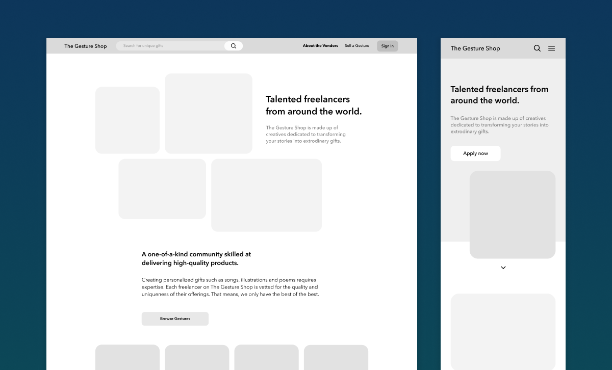
I then translated my sketches into wireframes for both mobile and web views, and shared them with the client for feedback.

Branding

Moodboarding

Gesture Shop's original brand colours were mainly blue and white, giving off a corporate vibe. I wanted to introduce more colours to warm up the website, reflecting the thoughtful and exciting feelings behind giving a Gesture. Further, I wanted the main colour to be some shade of blue keeping a degree of similarity to the original branding.

I created four moodboards and after discussing with the client, we landed on the following moodboard:

Developing the Brand Guide

While applying new brand colours to the wireframes, I finalized other design elements such as the logo, fonts, iconography, and illustrations. The following brand guide summarizes key components of the new design.

1st Prototype

Branding elements and images were added to the wireframes and a Figma prototype was created. Here are what the Home and Meet the Artists pages looked like:

Usability Testing

Test Plan

I chose five main tasks that encompassed all necessary steps in the workflow for purchasing a Gesture. Participants would be asked to complete these tasks during testing.

Afterwards, participants would be asked questions about their overall experience, feedback on copy, general impressions of the platform.

Findings

In total, three participants were recruited for the usability test. Two had never heard of Gesture Shop before. The following are a few key findings:

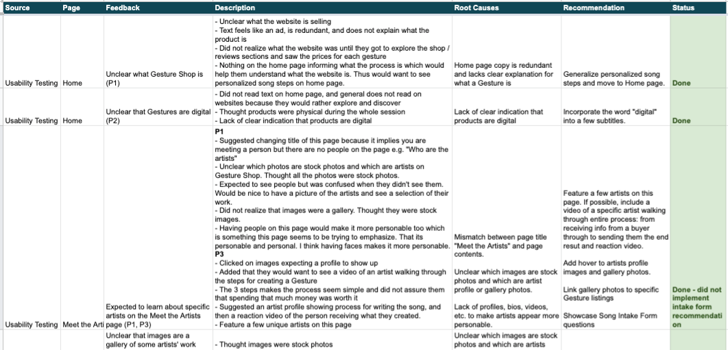
All usability issues were compiled into a spreadsheet that I then analyzed to identify root causes and design recommendations.

Final Prototype
Design recommendations and client feedback were then incorporated into the mock-ups to create the final Gesture Shop prototype. Click here to explore the Figma prototype.

Developer Handoff

The final stage of this project was ensuring that designs were communicated effectively to developers. I summarized the specs for each page in the Figma file. In addition, I included animations of some hover states on the Figma prototype.

Reflections & Learnings

Reflecting on this project, a few things that I would do better next time are:
Overall, I'm proud of how the re-design turned out. Some skills I learned along the way are: logo design, illustration, branding, and copywriting. Keep an eye out on thegestureshop.com for the new design to roll out!  
Finally, a huge shoutout to Rotimi Fadiya, my client from Gesture Shop, for this opportunity, and our close collaboration throughout the design process.

next project →

How I Would Design a Music Sharing Feature on Spotify